Survey Gallery
Lead Product Designer, 2018
+ Design Strategy
+ Workshop Facilitation
+ Research & Testing
+ UX/UI Design
The Survey Gallery is an experience that brings the Analyze portion of our product to medium-intent customers (roughly 1/3 of new users that sign up) to understand how it might allow them to gather insights and make decisions before they create a survey.
Status: This project is currently live. Visit the Survey Gallery here (you need to be logged in to your SurveyMonkey account).
“Allow explorers to see value in data analysis at the beginning of their user journey.”
Overview
We started out wanting to build a sample survey to display on the logged-in dashboard for new users. The survey would have interesting questions, responses, filters, etc. so the user gets a good idea of how the entire product works. The primary objective of this project was to showcase Analyze — both the great summary views and the powerful rules, charts, and overall capabilities. A secondary goal was to show an example of a well-constructed survey that provides new users some inspiration and guidance around how they could use SurveyMonkey features to create great surveys.
We had also identified an underrepresented group of our users who come to SurveyMonkey in order to explore the product and compare it to our competitors; they know they’re going to send a survey, although they may not need to do so right away. They’re also coming to our product with a sharp eye — they want to make sure we offer the features they’ll need at the value they’re looking for. And while we’re confident the product will empower them to do more than they likely have in mind, we don’t tend to surface that value early on in the user journey. These users are called our Explorers, and they’re a medium-intent group of users our product experience didn’t target.
My role
This project was originally specced as new Sample Survey feature to new users within our product. Once we started working on it, however, it became clear that were were setting out to build a new feature without really understanding what the problem we were solving for was. I facilitated a design thinking workshop with the team in order to identify the problem we were solving so we could ensure the solution would be the right one for our users. I also worked with our User Research team to run testing with potential users and used these findings to help the team write a clearer problem statement
Some of my contributions included:
Facilitated a design workshop to drive feature definition, goals, and strategy
Worked with content strategy team to craft a strong, insightful narrative with supporting media and visuals
Collaborated and built relationships with the engineering, product management and brand team parters working on the project
Put users in focus through research, design and testing
Business rationale
Our Business Insights team had uncovered a trend in user data that prompted our Product Manager to spec out an experience where new users would have access to a sample survey in order to be able to play around with our impressive Analyze tool before having to create their own surveys. We were seeing a significant drop-off our medium-intent users after completing sign up.
We knew we wanted to help our Explorers understand the value of our Analyze tool before the point when most of them were dropping off, which was after signup and before they ever finished building a survey. The Survey Gallery was designed to do just that: show them how we can help them analyze their data in a way that drives them to make business decisions and solve problems.
We hypothesized this experience would improve engagement rates (first deploy rate as well as draft, activate, and test rates), particularly for these users. However, we thought we might not see an impact to deploy rates within the first day or first week, so we planned to monitor the 28-day deploy rate of users. We targeted English-only, new Basic plan users.
Design Strategy & User Research
Design Thinking Workshop
I gathered 7 participants to work through several activities in order to generate ideas for Sample Survey. Their roles included members of the Product Design, App Security, Content Strategy, Visual Design, Project Management and Engineering teams.
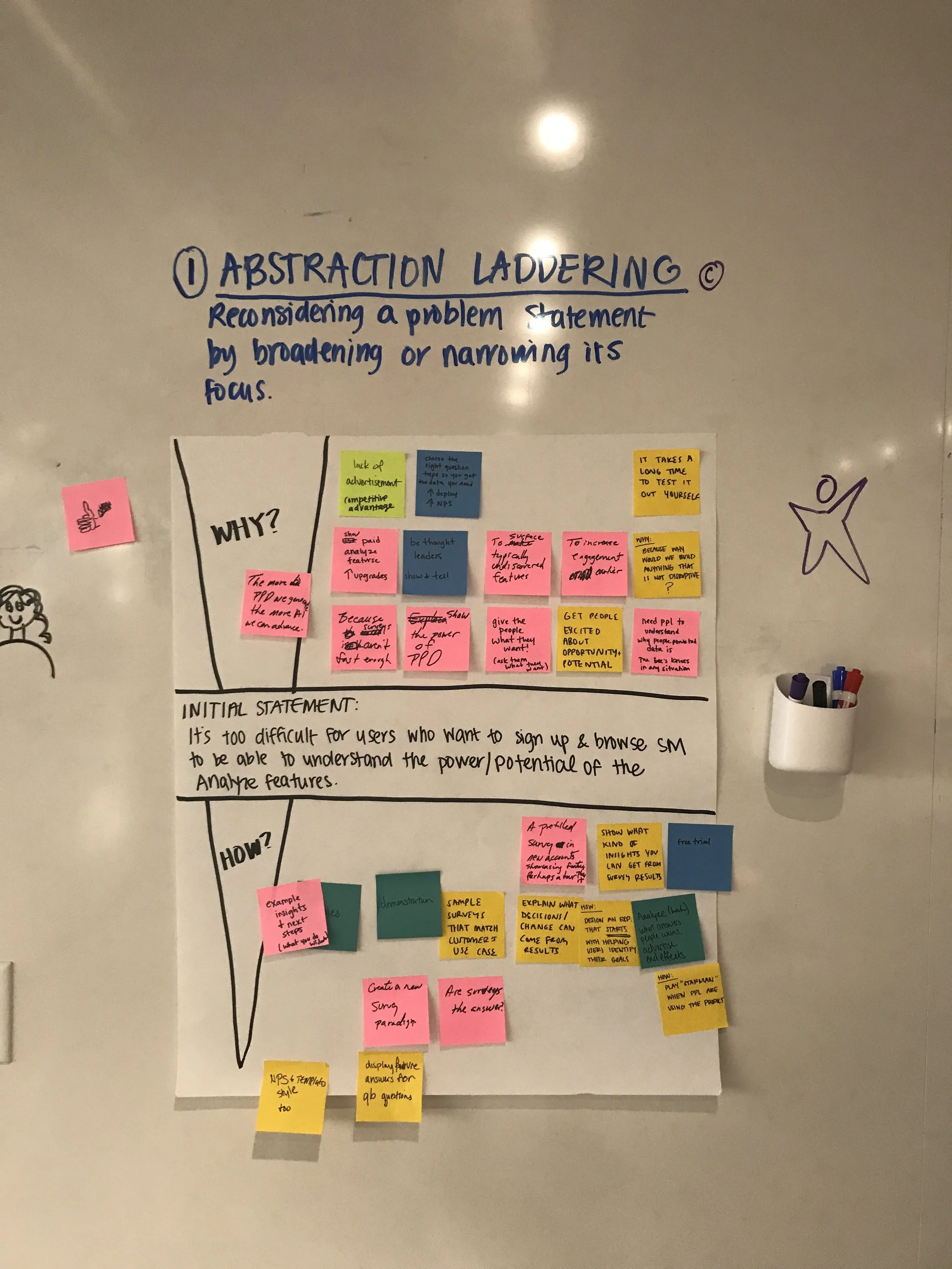
Abstract Laddering
A way of reconsidering a problem statement by broadening or narrowing its focus
Initial statement: It’s too difficult for users who want to sign up and browse SurveyMonkey to be able to understand the power/potential of the Analyze features.
Key concepts:
Show people how results work per question type
Every survey you make shows you sample results in real time as you edit
The value of surveys comes from the results and insights
People-powered data cannot happen without a platform
Help people to see themselves in an example
Creative Matrix
A format for sparking new ideas at the intersections of distinct categories
Importance/Difficulty Matrix
A quad chart for plotting items based on relative importance and difficulty
Four quadrants:
Luxury (High difficulty, low importance)
Animated graphs, tables, etc. to show insights
Strategic (High difficulty, high importance)
No more tooltips! Show users what’s possible without making them read
Targeted personalization
Multiple choice question → Here’s how your results will look
Quick Wins (Low difficulty, low importance)
Confetti for actionable insights
Random example questions
Emoji 🙂
Must do/High ROI (Low difficulty, high importance)
Highlighted Ideas & Themes
The more PPD we can generate, the more we can advance ML and serve to further personalize the product
Choose the right question types so you get the data you need (increase in deploy, NPS rating)
It takes a long time to test it out yourself
Sample surveys that match customers’ use cases
Show what kind of insights you can get from survey results
Design an experience that starts with helping the user identify what it is they want to learn
Marketplace of ideas and examples other customers have agreed to share
Industry-related insights (This is the NPS for your industry, for example)
Case studies (“How Pets Plus uses customer surveys” videos)
User Testing
I worked with the User Research team to design a test where we could discover what, exactly, our Explorers were looking for in order to make their decisions.
Results
Helpfulness: All 10 respondents rated the helpfulness a 4 or 5 out of 5
Key takeaways:
New users who are exploring still need us to guide them. We should:
Instill confidence that our tool is capable using question types
Instill confidence that our tool is easy to use with feature highlights
Inspire and educate on use cases and best practices by providing personalized templates and questions, as well as a walk-through tour of the process
Users may rely on browsing templates randomly instead of a sample survey at this point
Test Details
Cohort: 10 users sign up to explore what SurveyMonkey can offer on UserTesting.com
Task and questions included:
Sign up and explore what you can do with SurveyMonkey
Start creating a survey
If there was a sample survey in your account, what info would you need from it?
Where would you look for the sample survey?
How helpful or not is the concept of a sample survey?
Information Architecture & Diagramming
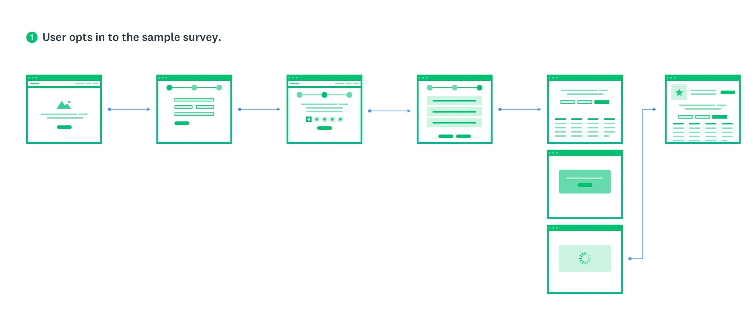
In order to better understand how this experience would work and to get a more comprehensive view of how it would exist within our existing core surveys platform, I led the team in diagramming and looking at the IA options in terms of entry and exit points, as well as how the experience might live within a customer’s account.
I started with diagramming out several ideas I had been thinking through with our product team, in the workshop, and in the product design critiques I had held with the larger design team.
Some considerations & lingering questions we wanted to answer included:
Would this be a guided tour the first time, then remain available to reference in the user’s account afterwards?
Will it be read-only or editable? If editable, how much? What are our guardrails? Can the user reset the data to the original data set?
How can the Sample Survey and Onboarding flows leverage each other to create a richer experience when combined but still stand alone when necessary?
Would we build a logged out/no account mode? How much will be in scope for the MVP release?
Key Takeaways
The Sample Survey and onboarding experiences should leverage each other to create a richer experience when combined, but still stand alone when necessary.
A marketplace of ideas and examples other customers have agreed to share would be helpful to users
The narrative should include industry-related insights (Ex: This is the NPS benchmark for your industry)
For future iterations, consider allowing users to see sample results in real time as they edit their surveys
A video is a key tool to show the value of this
Our goal is to help people to see themselves in an example
Sample surveys should match customers’ use cases
We should help customers understand they need to choose the right question types so they get the data they need (which will help to increase deploy rates and our NPS rating)
The feature needs to show what kind of insights users can get from survey results
I needed to design an experience that starts with helping the user identify what it is they want to learn
New focus: Survey Gallery
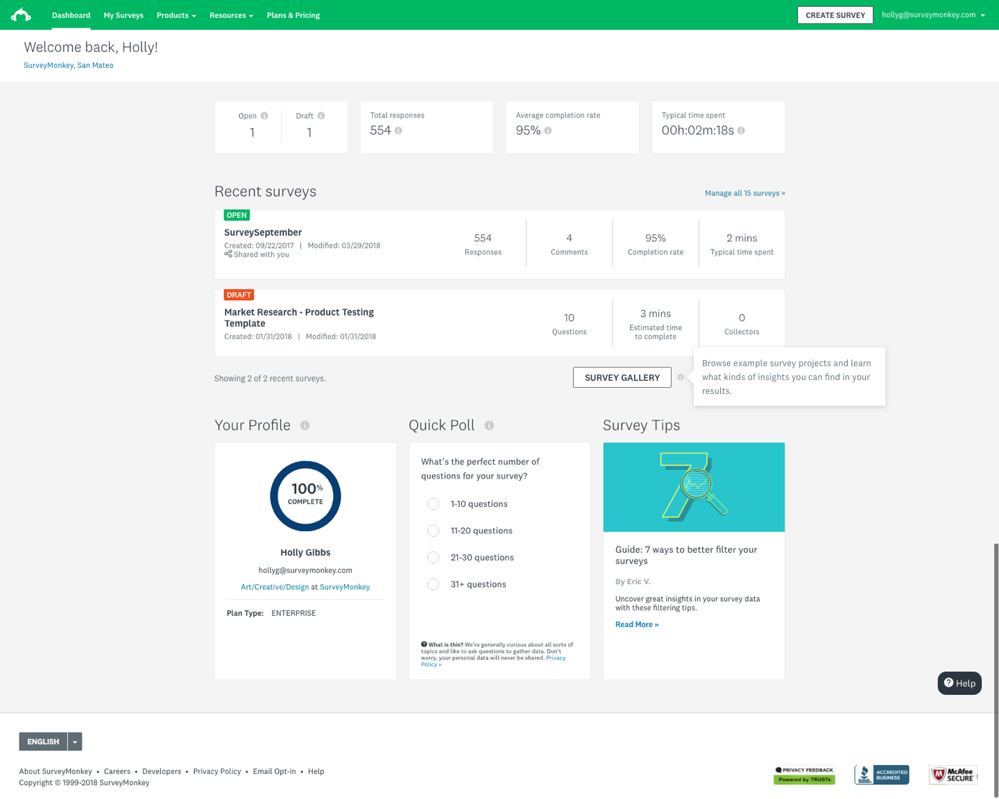
Our new focus was on creating a gallery of survey results (a lot of them!) where users could see themselves in our examples and get access to insights much earlier in their journey.
We set forth to build an in-product view of survey results that gives customers examples based on our most frequent use cases: Customer satisfaction, employee engagement, and market research. We would utilize shared data links from the Analyze platform so we didn’t have to rebuild the results views, and users would be guided through survey results with auto-progressing tooltips they could go back to and click around freely to view tooltips related to content they're interested in.
Our CSAT surveys had the lowest 24-hour deploy rate, so we wanted to make sure these users especially understood that results they could get back after they deployed (and what they could learn from those results). For those users, we were looking to improve the initiate-to-deploy rate.
Eventually, we wanted to create a gallery of survey results both built by us and submitted by our users. The gallery would serve as both educational to reinforce best methodological practices and a marketing tool to show these medium-intent users the value we could provide them.
Scope of designs
Desktop and tablet landscape only (for experiment)
No I18N for experiment (English only)
For the initial launch, we focused on the immediate needs for Survey Gallery — primarily on the entry points and highlighting the hand-selected survey experiences. As a result, we expected there to be more design work needed in the future.
Explorations and Iterations
Experiment
Our key performance metric was user engagement, where we were hoping to see an increase in deploy rates.
The test was shown to 30%, then 50% during the experiment. Once we reviewed and modeled out the results, we released the feature to 100% of users.
Users who interacted with the Survey Gallery had a 9.2% lift in their survey deploy rates across the board.
Results
The feature launched to 20% of users, and we immediately saw a statistically significant jump in deploy rates.
Version 2 has been specced out, but has not been resourced at this time.
Learnings
Make sure you’re answering a question or solving a clearly defined problem before you start coming up with solutions
Work with engineers early to prioritize key interactions within the experience
V1 was shipped without the beacons, which were a key element to the experience
Phase 2 doesn’t always come, so make sure you’re proud of what you’re shipping as an MVP experience


