Concept Testing product
Senior Product Designer, 2019
+ Design strategy
+ Workshop facilitation
+ Happy path and IA design
+ Sketching, whiteboarding, wireframing and iterating on user flows
+ Research, testing and designing iterations
+ UX/UI design
+ Interaction design & specifications
+ Cross-functional collaboration to help facilitate hitting business targets and launching a new product
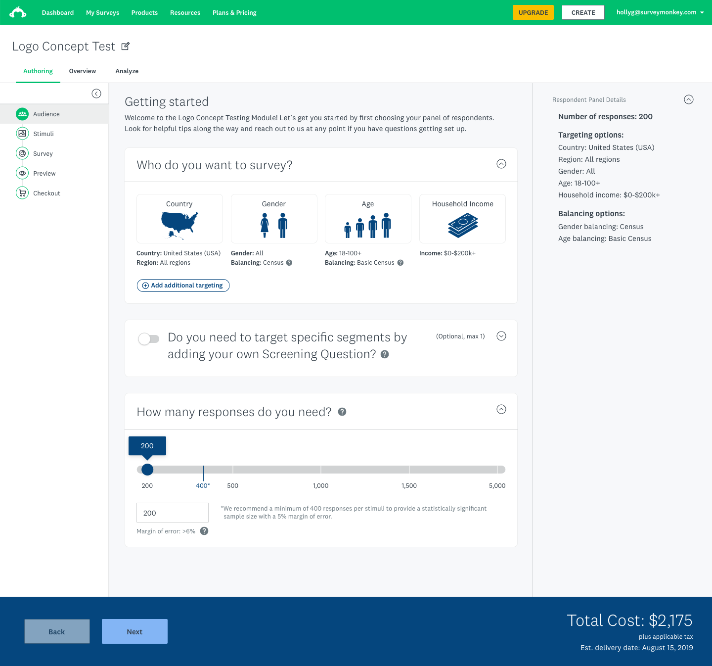
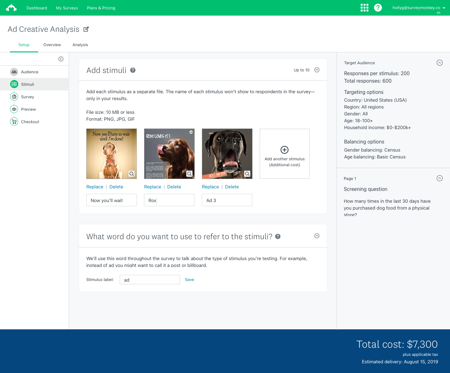
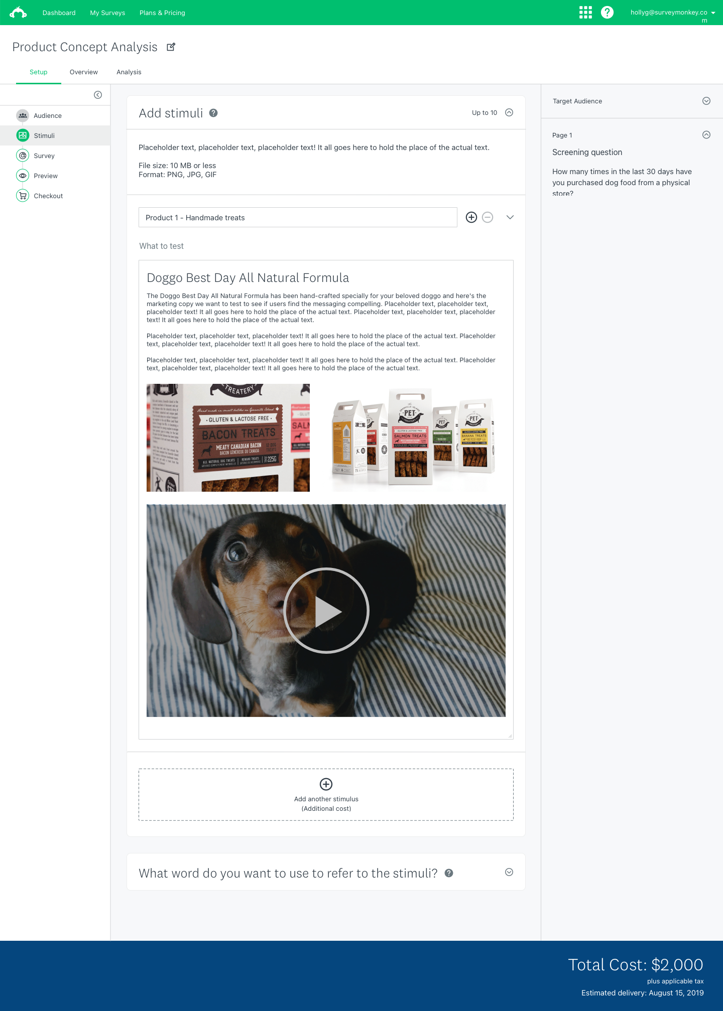
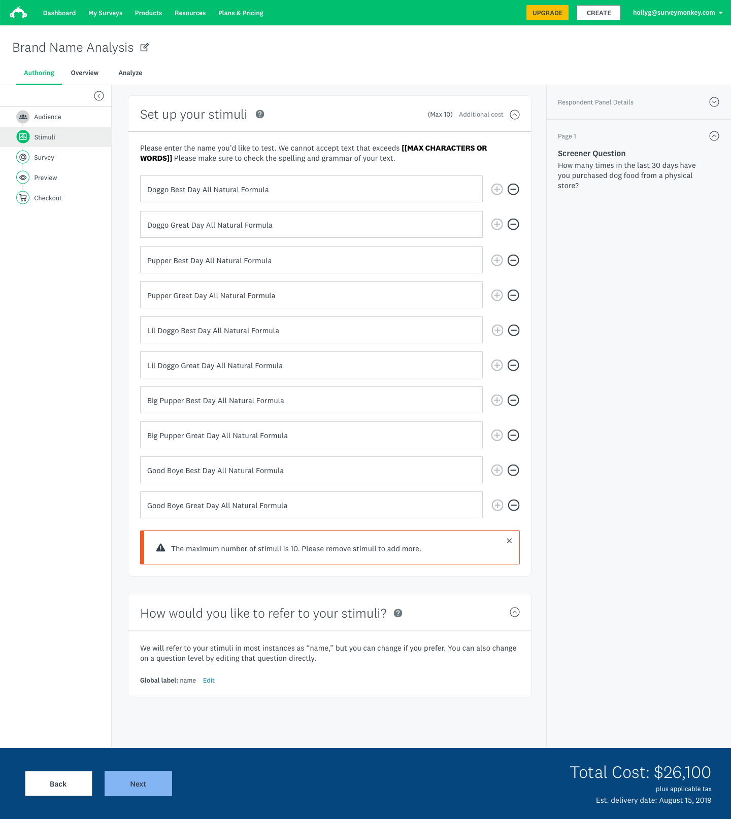
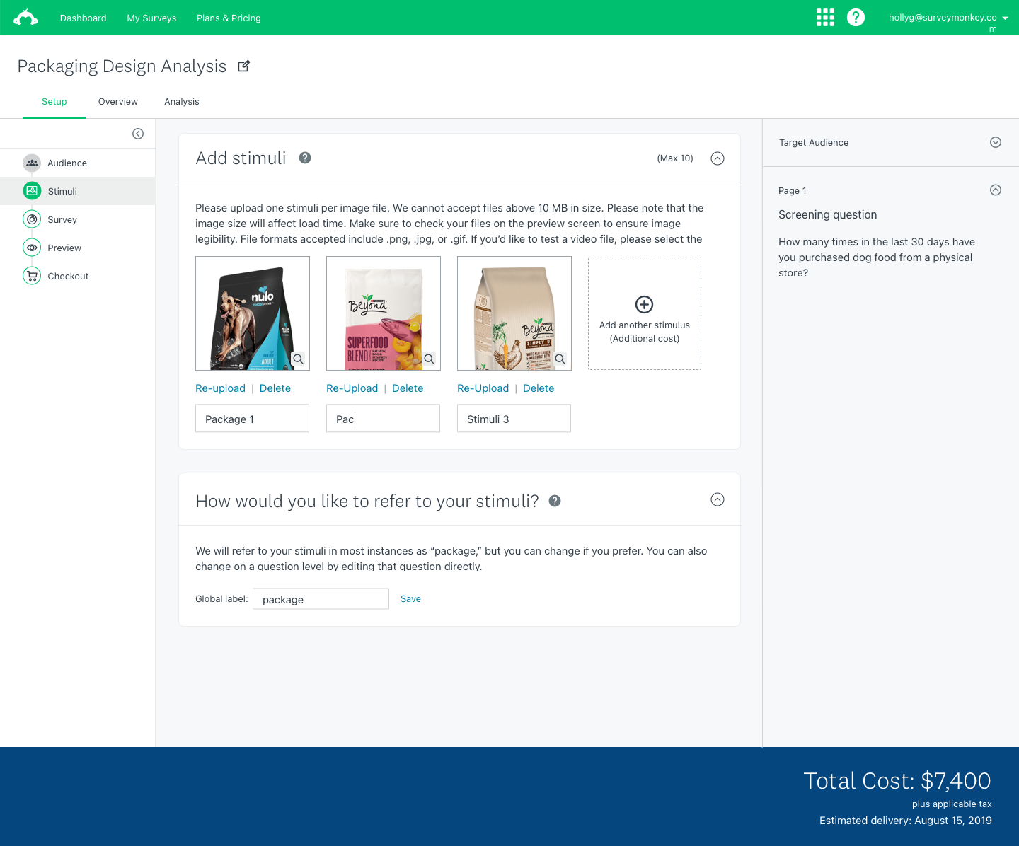
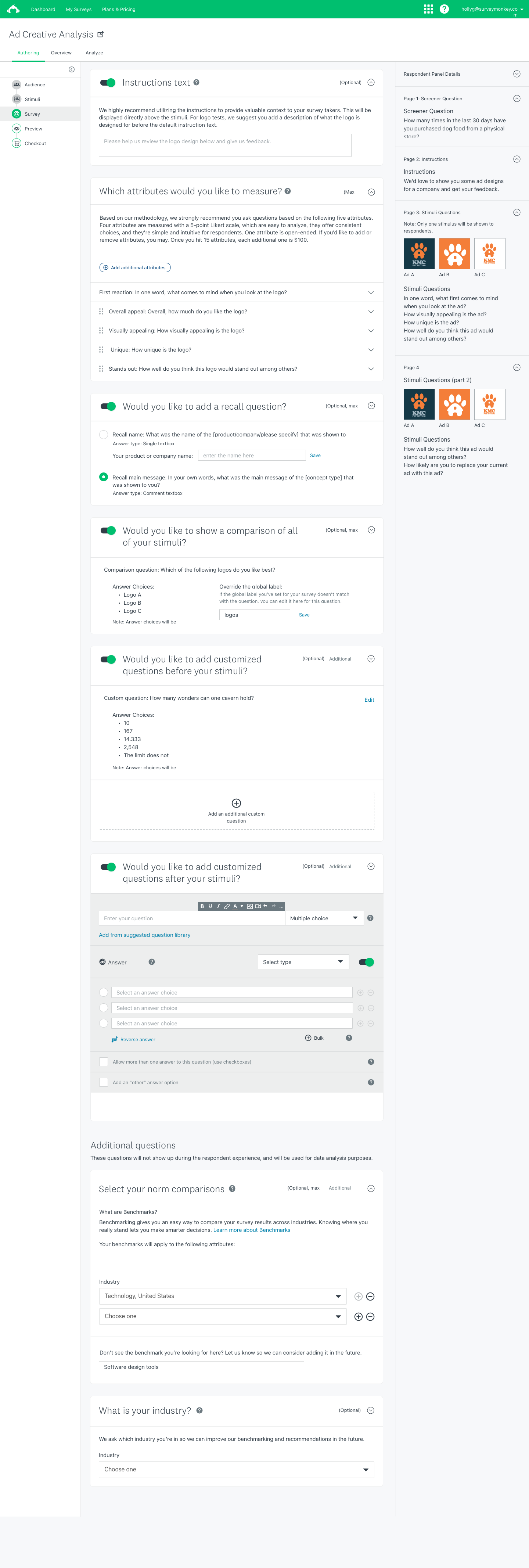
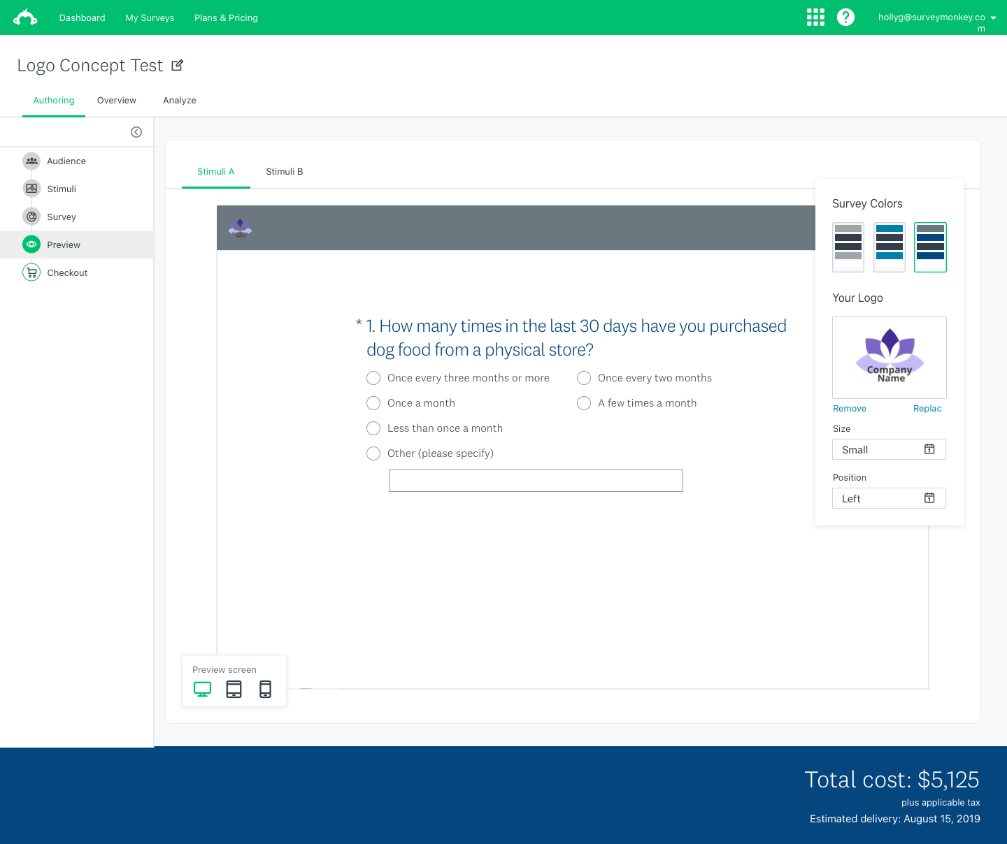
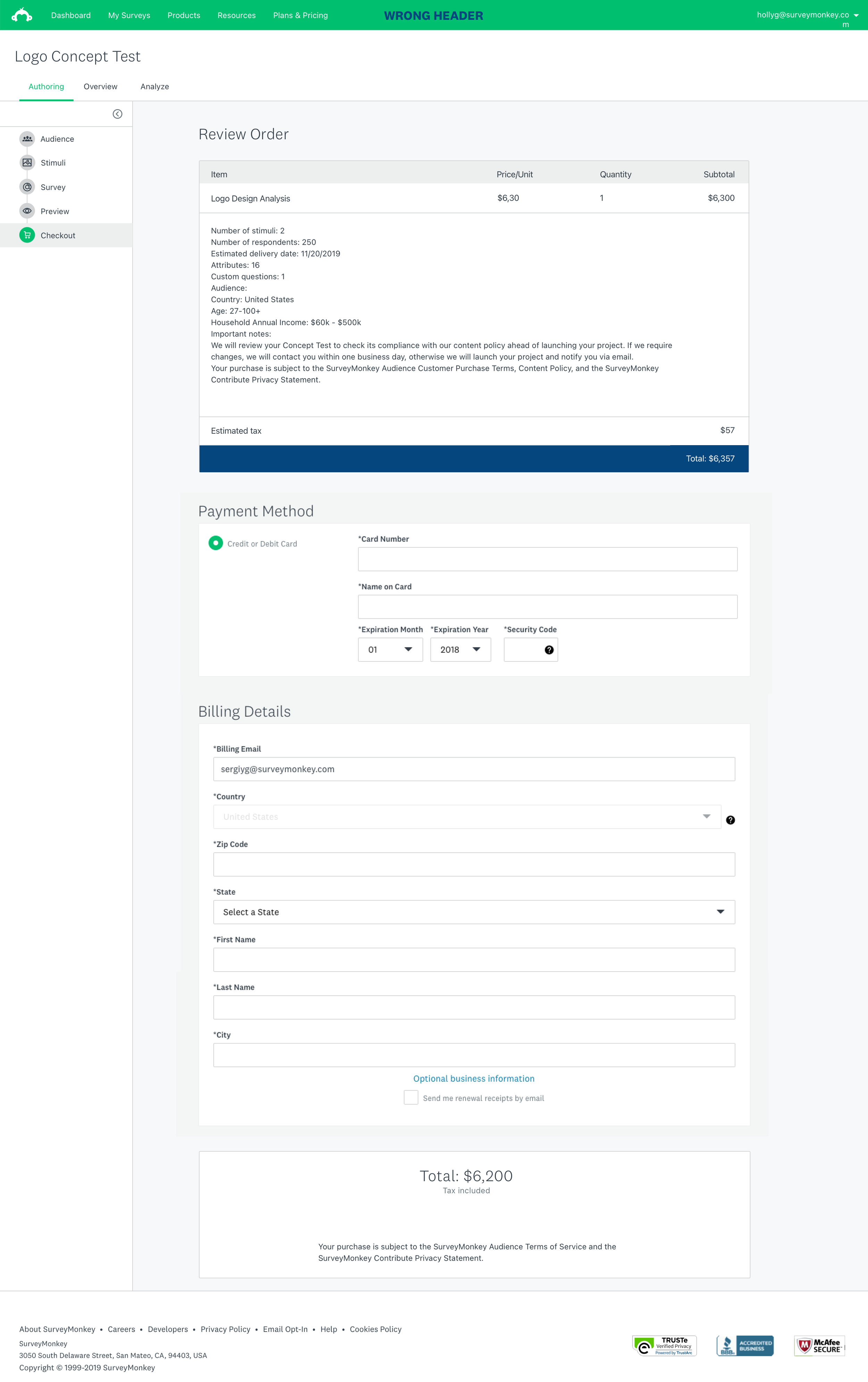
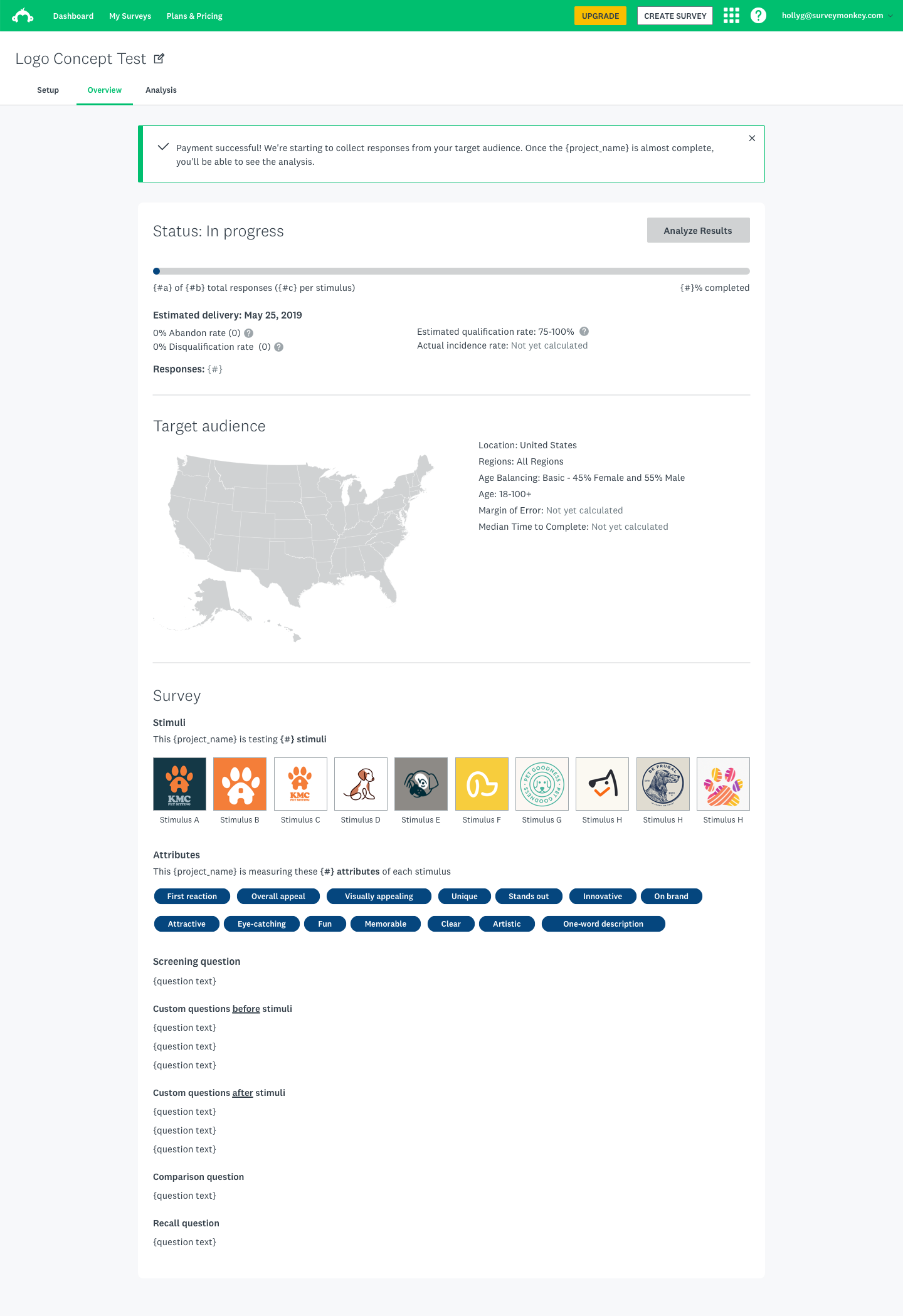
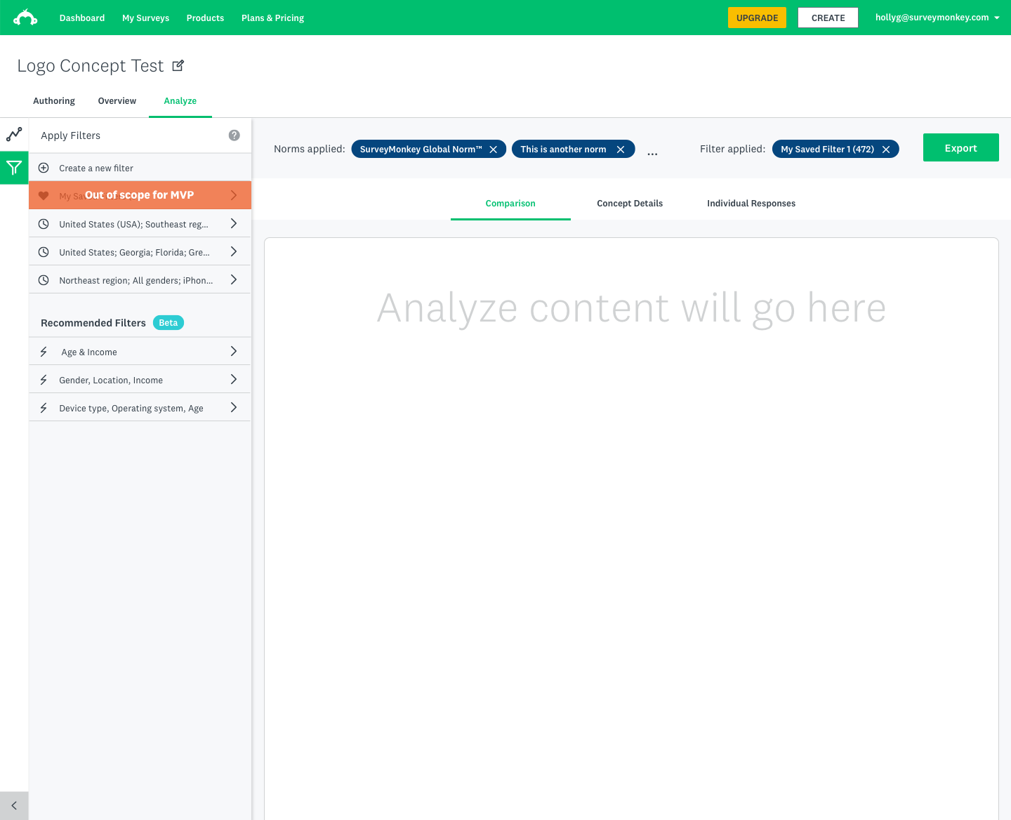
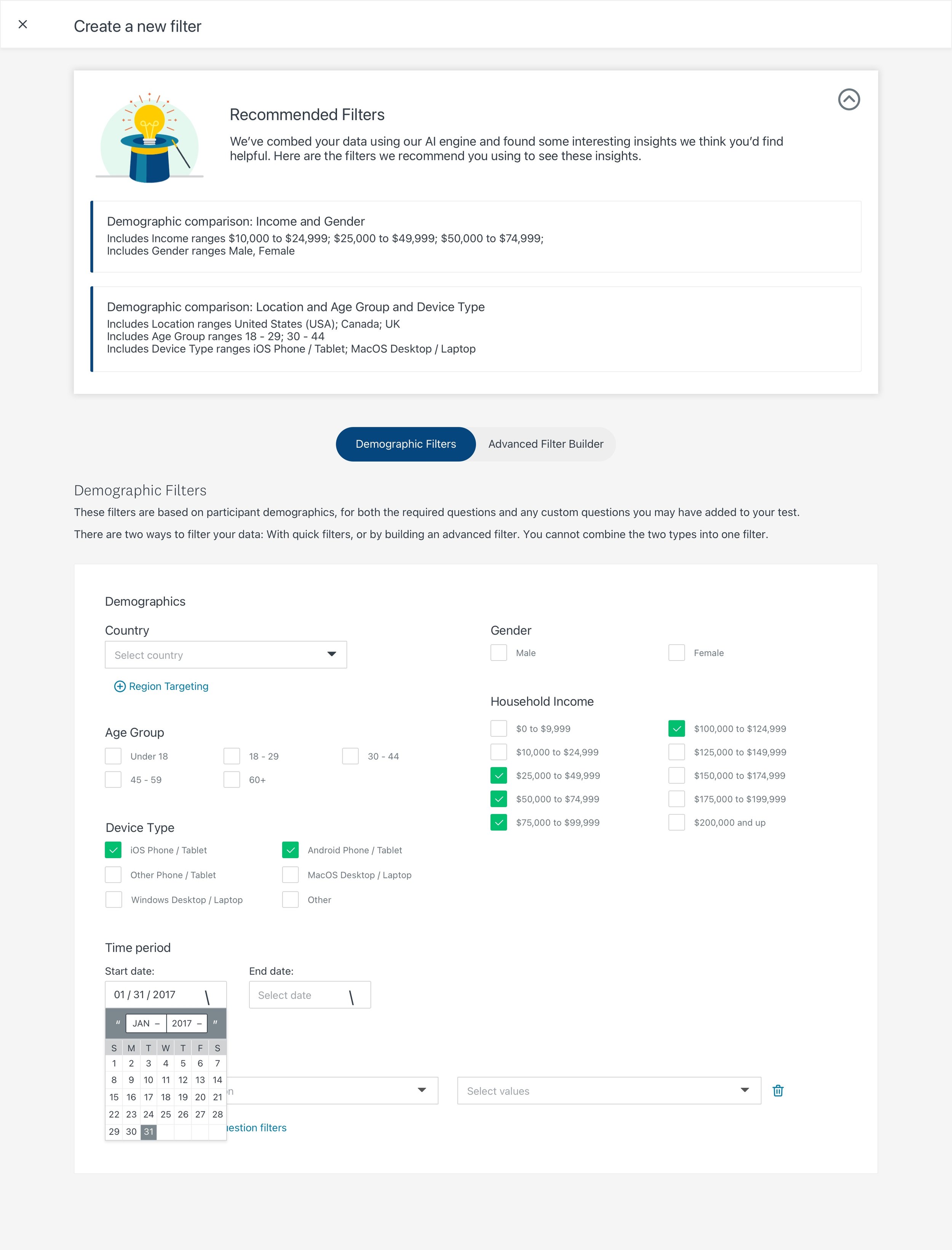
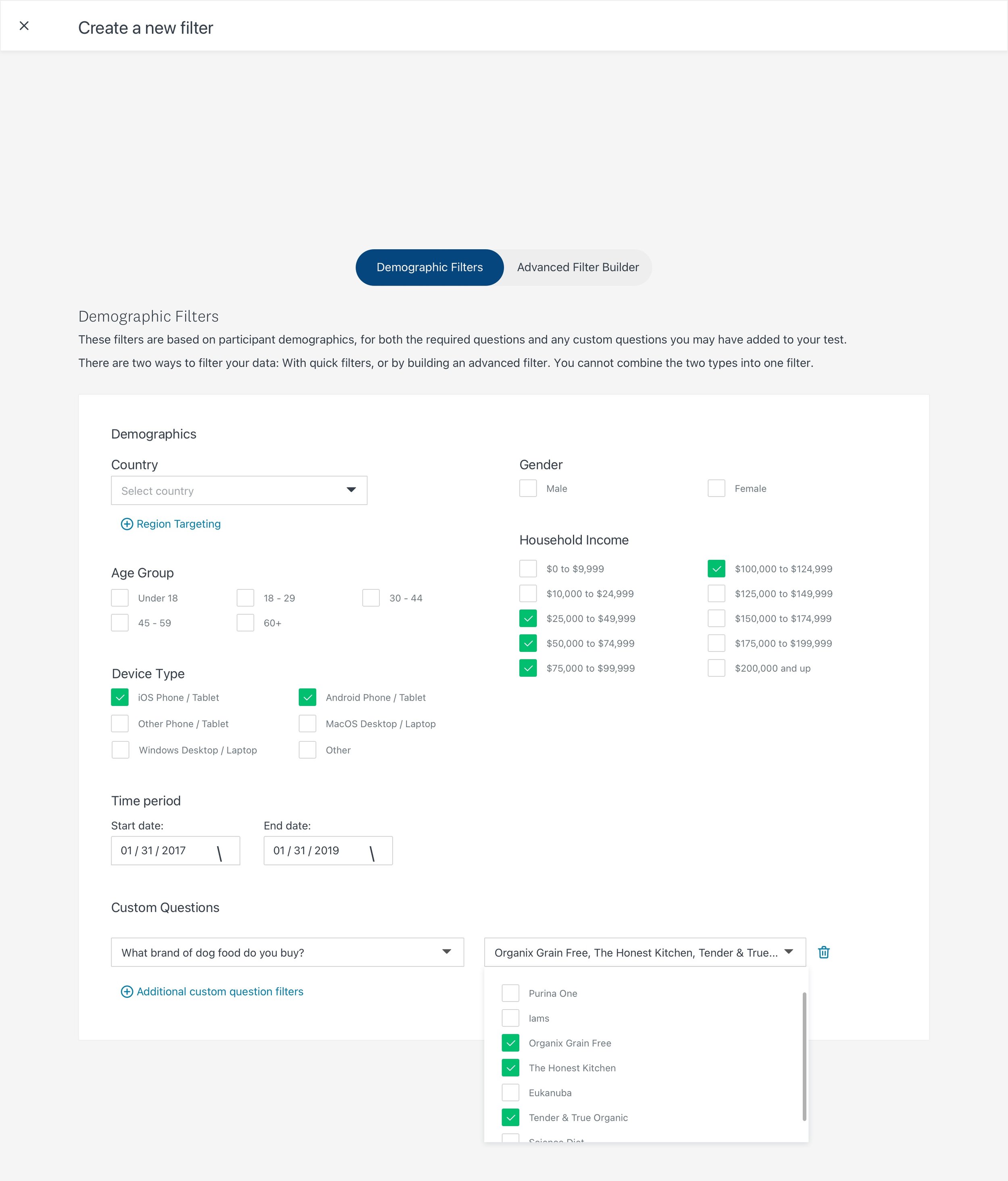
We created a tiger team within the SurveyMonkey company in order to strategize and build out a new product on our platform: Concept Testing modules that will allow users to leverage our experience and methodologies with the flexibility of a competitive, DIY testing product.
Status: This project has been launched and can be found here on the SurveyMonkey (now Momentive.ai) website. Here’s the product announcement if you want to check that out, as well.
“Broaden our service offerings by creating a tool that customers — from Insights Professionals to in-house design teams — can use to test and validate their concepts.”
Overview
At the time we embarked on building this product, the SurveyMonkey platform provided rich features for all users, but we were not orienting our survey tool to address specific user needs. What if we could stay horizontal to serve a large user base, but also go deep to deliver higher value to our users and business? We imagined users coming to SurveyMonkey to choose a product that is highly tailored to their specific needs and workflows, right on our core survey platform.
My role
As a senior designer on this project, I worked closely with stakeholders and cross-functional teams to define and execute this project.
Some of my contributions included:
Facilitated design workshops and collaborative sessions with cross-functional teams to drive feature definition, goals, and strategy
Planned, directed, and orchestrated multiple design initiatives throughout the project lifecycle
Managed and coached designers across teams, levels, and disciplines
Advocated and applied user-centric processes in collaboration with cross-functional teams and put users in focus through research, design and testing
Business rationale
At the time, SurveyMonkey had 17.5 million active users who use our surveys to learn valuable insights on countless topics. How do we know which user group to target? What are the criteria we need to consider? Where do we even start?
Our strategy and research teams had done some great work and came up with a shortlist of the top 12 use cases to consider.
That was a great start, but there was still a lot to do until we could identify one use case we all could get behind. When we interviewed key stakeholders, there were different opinions on strategy and directions. In order to succeed, we knew we needed to build a shared knowledge base, build trust among cross-functional teams, and focus on the end-users.
Design Thinking Workshop
We planned, proposed, and ran a two-day workshop with 15+ attendees from engineering, product, design, research, strategy, marketing, leadership and customer service. Thanks to everyone's participation, we were able to achieve some great outcomes.
Our VP of Product presenting the project's business rationale
Shared knowledge base
It's important to bridge our knowledge gaps by sharing what we know and make well-informed decisions collectively.
A multi-day cross-functional workshop at this scale is costly. We reviewed and iterated the agenda with key stakeholders multiple times to make sure we used their time wisely and everyone found value in our time together.
The topics we covered gave us valuable insights including historical context, business rationale, company strategy, research findings, and goal alignment.
Design exploration exercise (based on a hypothesis the team built in the previous step)
Design exploration
We had the attendees work together in smaller groups to build design hypotheses and explore design solutions. It was a great way to get the cross-functional team comfortable participating in the design process.
A persona taking shape during a whiteboarding exercise
User empathy
We identified key user personas for the four use case categories and role-played to map user journeys. This helped the team to build empathy for our users, which served as the foundation for our processes going forward.
Design exploration exercise (based on a hypothesis the team built in the previous step)
Prioritization matrix
The workshop was designed to explore the use cases from different angles such as user needs, business objectives, product scalability, etc. At the end of Day 2, the team gathered all the info they learned and ranked the use cases in a prioritization matrix defined by Opportunity and Ability-to-win (Feasibility) axes.
This was not the end of the strategy phase, but a well-inform opinion that came from the team. I used this to start the synthesizing process with our key stakeholders.
We partnered with our cross-functional counterparts to synthesize the workshop's outcomes and presented our findings and recommendations to C-level leaders. They provided us valuable insights into the company's holistic long term goals and identified opportunities where we could align our goals with those of other teams. We took another round of concept validation with targeted users to nail down the final use case. We visualized our product vision via high fidelity design and slides which we used to present to the whole company.
Why Concept Testing?
The Concept Testing space is worth $3.2 billion in Total Addressable Market, and 45% of the Market Powered Data use cases.
Targeted audiences: Research & Insight Teams, Consultant & Ad Agencies (primary) and Marketing Team (secondary).
We have a strong ability to win and differentiate with our own audience targeting proprietary panel.
Our work is scalable because we can replicate the framework and use the same components to allow users to test multiple concept types (ie ads, logo, messaging, etc.)
Design Execution
Our users are the experts in the fields, so we needed to build a tool that fits their workflow. We wanted to be as user-centric as possible while staying lean & agile.
Discover
We interviewed our internal market researchers to learn about their tasks and workflow because they run concept testing projects as a part of their day-to-day jobs. We looked at processes for testing ranging from ad campaigns to messaging strategies.
Define
We learned our user's needs often vacillate between two opposing forces; for example, they want standardization but also flexibility. Our design team developed a series of ‘tensions of needs’ to guide us through the design process.
Design
We created holistic flow charts, broke down the work into different flows, and set up frequent check-ins for review and feedback. This helped us achieve a large amount of work while staying connected to the bigger vision of our product goals.
Iterate & Test
We held bi-weekly usability testing sessions and iterated quickly based on user feedback and developing business needs.
Feature Discoverability
Using our existing panel selection tool, the testers had a hard time finding the robust options our Audience panel offered because the first thing users think of when they start a concept testing project is finding their targeted consumers.
After the iteration, all of our testers got through this step in 50%+ faster than the previous group.
Results
I led 3 designers from various teams to work with our cross-functional partners in an agile and iterative process to successfully deliver this new product on time. I also supported 67 engineers while the experience was being built, collaborating on everything from error messaging and server calls to the visual design of the product experience.
We developed the user's "hierarchy of data needs" from the discovery phase and used it as a compass to guide us through the design and iteration steps. Our design is a validated direct translation of the user's workflow.
““My end goal is how to close the loop with stakeholders and use data to tell the story in a compelling way””
Learnings
Working on the company's flagship project at this scale meant I had to be organized, have a deep understanding of both user and business goals, and to be a strong leader and cross-functional partner. I was involved deeply in both the strategy and the execution, which brought on a lot of learnings for me. Our team meetings, company presentations, and feedback sessions from our boss and stakeholders all were opportunities for leadership and storytelling, and I believe I rose the many challenges of this project as they came up.
Create alignment around what success looks like
When I came onto this project it had many names: Use Cases, Modules, and Platform Solutions, among others. We were given a wide range of definitions and directions from different team leaders. With the support of the cross-functional team, our collaborative workshop laid the foundation for us to bridge gaps and review the project under multiple lenses. We were able to unite in a single direction moving forward because we aligned on what success looks like early in our process.
Understand which problem you're looking to solve for which group of people
User-centric isn’t just a design approach; it's a mindset that needs to be understood and practiced by everyone involved. By involving a diverse team in the beginning, we were able to gain valuable inputs from our research, strategy, product, engineering, and customer support partners. This collaboration also helped to build rapport and trust among teams, ensuring their participation throughout the project.
Prioritize and remove the extraneous
While we were able to move from ambiguity to execution rather quickly and efficiently, there were features that were cut due to multiple reasons. We decided to only deliver what we would be proud of instead of aiming for an MVP. While the work was far from finished when we launched the new product, we were all proud of what we built and had a clear understanding of how we can improve the experience in the future based on user feedback.


