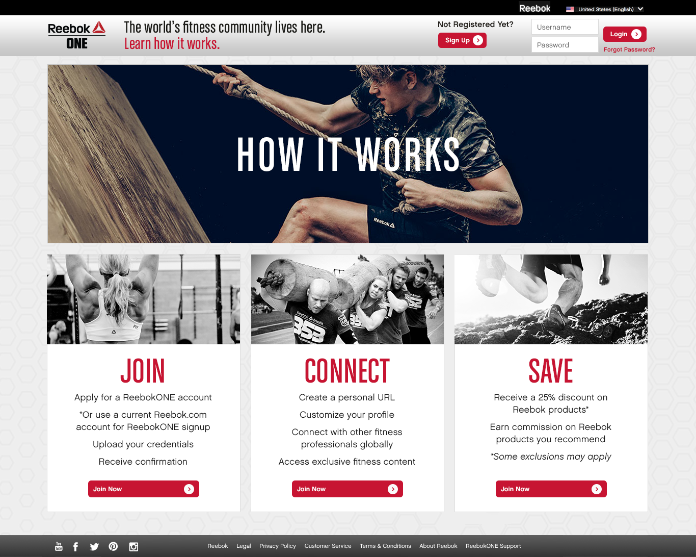
ReebokONE instructor network social platform
I worked on the design of the ReebokONE instructor network responsive web platform. Our team designed a responsive desktop experience, overhauled the client's digital strategy and completed a heuristics analysis. We started with several rounds of concepts for the overall style and then built out the end-to-end experience, during which I worked under the lead of Melissa Carmichael. We focused on Reebok's three KPIs – acquisition, sales and engagement – in order to drive our design strategy and to identify the business goals we wanted to help the client to achieve.
Typeface: Reefont
+ UX/UI design
+ User and pattern research
+ IA
+ User flows
+ Marketing design
+ Social media integration strategy
+ E-commerce
Problem
Although their new-member enrollment was on track to hit the client's forecasted goal, the sales and engagement targets needed some help if their numbers were going to stay on track for the year. The ReebokONE website is their social platform for CrossFit athletes, Spartan racers, personal trainers and fitness enthusiasts, and our team's main focus was to make the platform more accessible to users and to integrate the e-commerce experience with the social content.
Process
The lead designer and I worked to establish a visual language for the update while also performing an analysis of the site's IA. Once we settled on a direction for both with the client we began overhauling the entire experience, from the logged-out marketing pages to the scheduling feature. We overhauled the sign up and login flows to decrease the time and investment for new and existing users to put in so we could get them into the experience easier and faster. We created a dashboard that served as a central hub for social activity, educational content, community events and e-commerce. Users were able to discover content as well as create their own within the same interface, and following group activities was baked into the interface, as well. We also created a way for users to find fitness professionals based on location and specialty.
Results
The website and mobile app, which was developed in tandem with our project, increased user engagement and in-product revenue exponentially (note: we are not allowed to disclose the actual numbers). In addition to increasing the numbers, the platform helped to facilitate the client to surpass their yearly targets as well as their social media audience size.
The current version of the site was updated when the client launched their new brand identity.


